Ahoy!
It’s been a few months so I figured it was time for another devlog! Rather than focusing on one specific topic like the previous posts, I’ll be covering a wider variety of stuff like some level design, music composition, and concept art for Arbiter.
Environments
First up is environmental art. While I don’t mind level design so much, environmental art on the other hand is probably one of my weakest skills. As such, I’ve put in a significant effort to improve over the past few months so I can create some good looking environments for the game. What this basically amounted to was making a whole bunch of shaders, starting with the terrain.
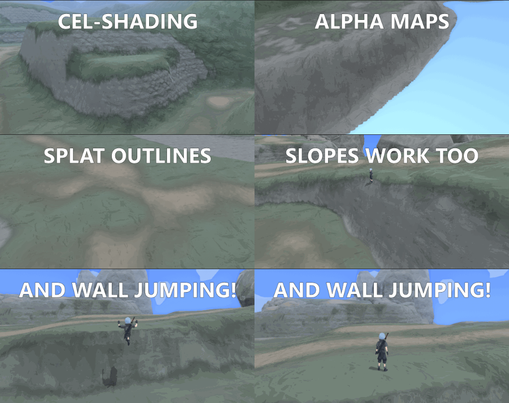
Terrain’s kind of the framework for how the levels are designed, so I wanted to make a terrain shader that could hold up well on its own while still fitting the game’s art style. This led me to make something of a cel-shaded terrain that was very customizable while still blending seamlessly into the props/foliage. I’ve covered some of the features in the above gif, but the full list includes:
- Cel-Shading: Lights the terrain using a step-based calculation.
- Cel-Shaded Splat Map Blending: Maintains style while still blending textures.
- Alpha Map for Transparency: Useful for things like islands/holes. This is a simple texture laid over the splatmap.
- World Space Gradient Map: Used to create a colour-based vertical gradient.
- Fresnel (Rim Lighting): Very soft lighting of edges based on view direction.
- Triplanar Mapping: Used to avoid texture stretching on steep angles.
On top of that, I spent some time redoing the slope/wall jumping system so that it works well on terrain and prevents characters from getting stuck or climbing slopes they shouldn’t be able to climb. When you put it all together, you get something reminiscent of a PS2-era environment:
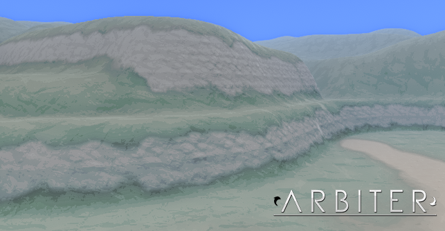
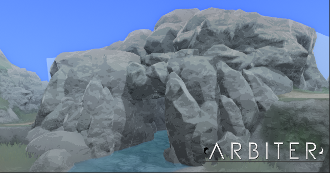
This is of course without props, however, which was the next step (and key to getting things to feel more modern). The props use largely a similar shader, save for things like splatmaps and triplanar textures. To help them blend into the terrain, they use the exact same parameters for the gradients (and in the rocks’ case, the base colour textures as well).
As usual, it was super important to me that I could make this stuff quickly. To achieve this, I generally only use the normal maps baked from high poly models for the environment detail. This tends to make everything look a bit flat compared to AAA standards, but the result fits the game’s style quite well (and is incredibly easy to make). That said, occasionally I’ll still paint a texture here or there if I need some very specific detail on top of the base maps. But with all of this in mind, you can assume that the only textures used here are flat colours and a normal map – that’s it.
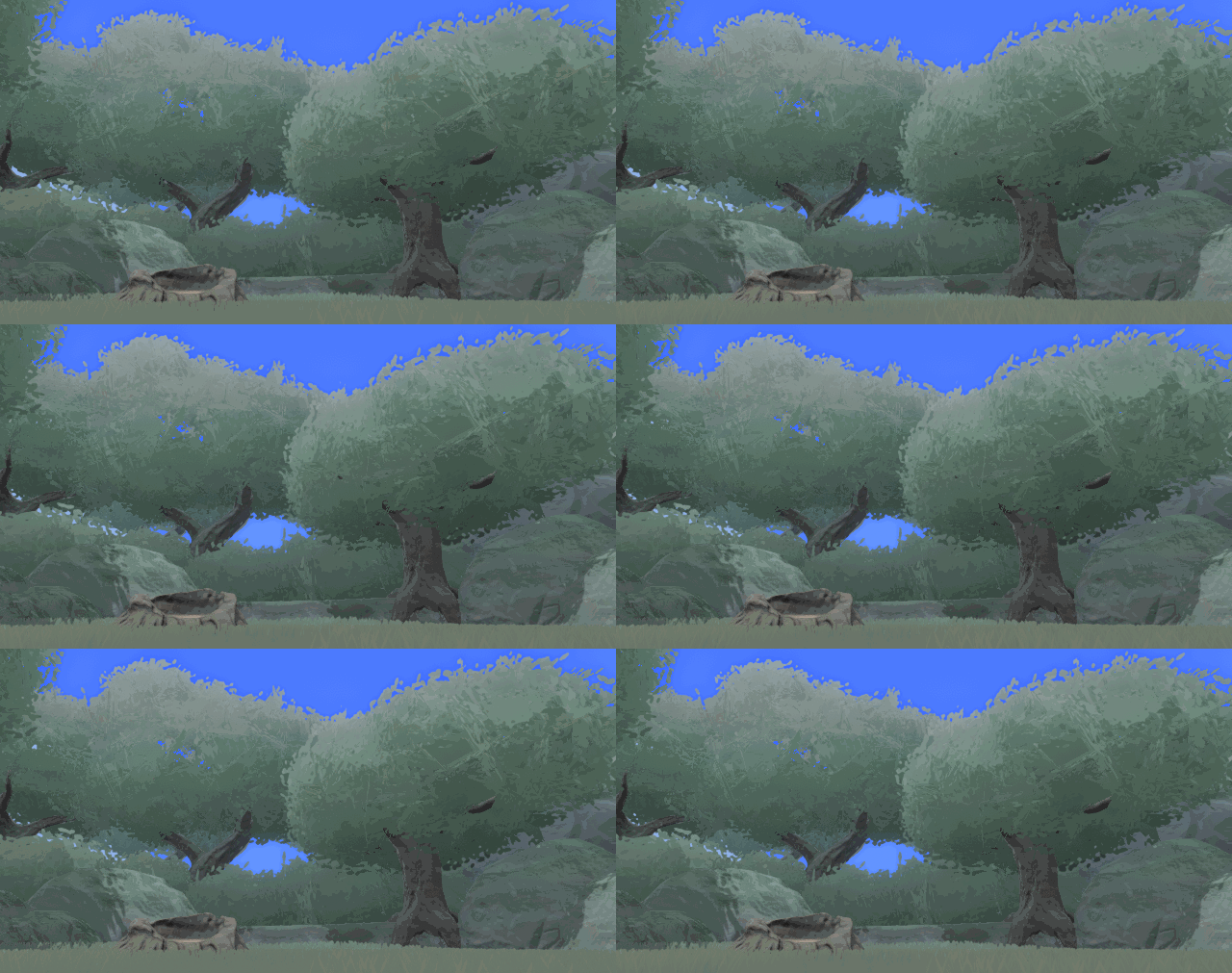
Next up were the trees. The trees generally use the same shader as the props/terrain, but they have some additional parameters for the leaves. One of these was shadow strength, which let me control how visible the self-shadowing on the leaves are to prevent ugly shadows. The others were a simple swaying effect to keep them lively and alpha map support for the leaf textures. Like everything else, the trees also have a soft gradient to keep them in tune with the scene.
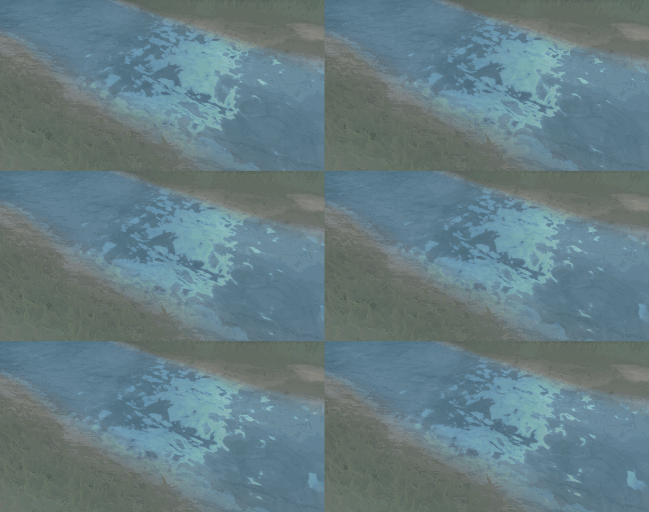
From there we moved onto water! To actually model the water, I used Unity’s newly acquired tool ProBuilder. This allows you to quickly create a mesh right in the editor without having to switch back to a modeling program. That being said, I export back into 3DS Max anyways to get more precise control over the UVs.
The shader was tricky because I wanted some more high fidelity features like reflections and normals, but in a toony art style consistent with the rest of the game. This led me to adding the features of both, but keeping them subtle so as to not take too much away from one another. The water itself is pretty simple though: reflections, depth color, foam, and panning normals pretty much make the effect. I’m pretty happy with the result, but I’ll be looking into things like refraction in the future to make it even better (as well as an alpha map control for things like waterfalls).
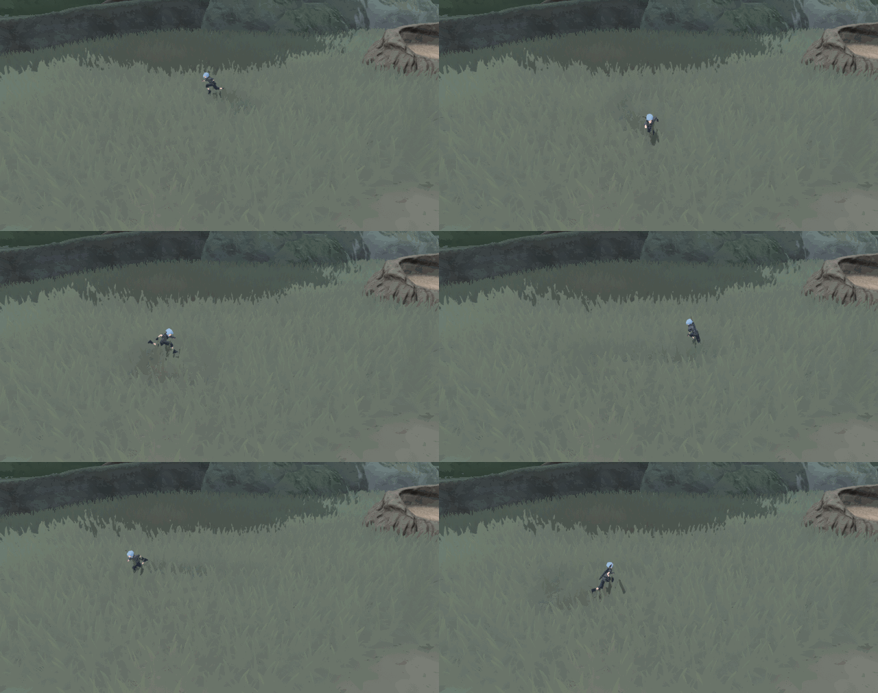
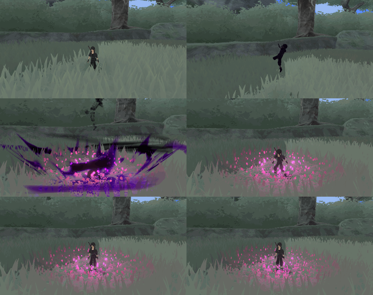
Lastly is the grass! I just did the grass this week so there will probably be adjustments made to it, but I’m feeling pretty good overall. The important things for me here were blending grass into the terrain, grass trails that follow characters around, and being able to burn grass by use of abilities.
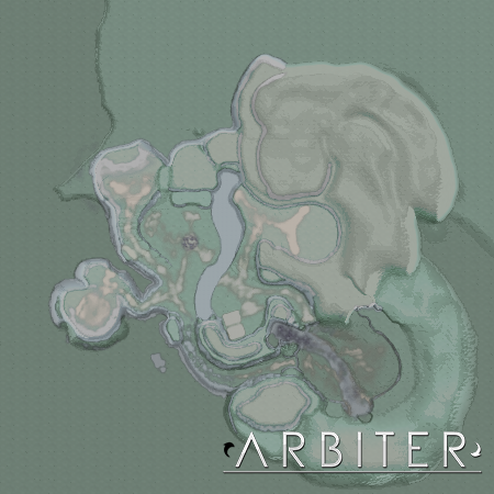
The first one was easy. I rendered a pigment map of the level and implemented it into the shader by converting the grass’s world position to texture space, and then colored the grass based on where it was relative to the terrain. This is a technique learned from the excellent landscape system breakdown for The Witcher 3. The relevant information (terrain size, pigment map, etc.) is controlled by my Level Manager and set as global parameters that the shaders access at runtime.
For the grass trails and burning effects, I followed this great tutorial as a base and then improvised to make it work how I needed. I ended up using two RenderTextures because I wanted full control over the colour for the burning effect, and I wanted the grass trails to fade out over time. Since both use the alpha channel to show where they’re covering, two textures were required to have enough control over everything.
What it boils down to is the following:
- Create two RenderTextures at 512×512 (one for the trail; one for the burning).
- Convert the world space position to texture space, similar to the pigment map.
- Send the desired size/position/color to a material that paints onto these textures.
- Like the pigment map, have the grass do stuff based on its position relative to the textures.
- Shader Magic ™
- Profit.
Music
Ever since the Kickstarter I’ve wrestled with whether or not I want to hire a composer. I actually really love composing music myself and I’ve been learning on and off in my spare time for about three years now (I did the music for the trailer and demo last year, though looking back on it that stuff sucks). Throughout 2018, however, I’ve both finished and sketched out a whole bunch of songs for the game’s soundtrack, and I’ve reached a point where I can confidently say that I will be making Arbiter’s soundtrack myself (still need a sound engineer though).
That said, I’m still a bit self conscious about sharing it. But for the greater good, today I’ll be sharing a sample of the Mini-Boss Theme I plan to use for the game. Like most things, its subject to change as I continue to improve it, but for now I’m feeling pretty good about it!
Concept Art
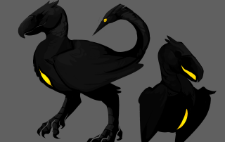
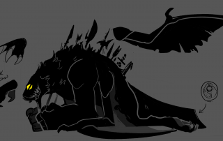
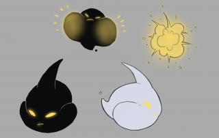
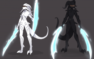
Lastly, I’ve got some concept art to share! I’ve been working with a whole bunch of talented artists to design enemies/characters for Arbiter, and we’re just about done designing everything. I think there’s around 5 designs left to do (out of about 20), at which point I’ll begin the modeling process for all remaining enemies, bosses, and human characters. I’d like to keep the character designs secret since Arbiter is a fairly story-focused game, so I’ll only be showing some of the enemy designs today.
Anyways, here’s some of the enemies. From left to right the artists are:
- Grey Liwanag (Idea by Backer)
- Grey Liwanag
- MGO
- Puni
Conclusion
Thanks for tuning into another DevLog! I’m sorry for the downtime between these, but I’m particular about what I choose to show/not show, and don’t want to to bother if it’s not worth sharing. Rest assured, progress is coming along smoothly.
I think after this first level is finished, I’ll be going back to some gameplay stuff and potentially some UI design as well, we’ll see! Until then, you can get more regular updates both on my Twitter and the Arbiter Discord, so check them out if you’re interested!

